

For our wedding, we decided to use the names of movies that all depicted a different part of Halloween for each of our tables. We had vampires, zombies, slashers, ghosts, witches, graveyards, etc to catch every aspect of the Halloween mood. Now that presented a very unique problem...there was no centerpiece that was going to work for every table. So guess what we did? We did different themed centerpieces for each table! They looked incredible...but that is for another post. This post is about the unique signs I digitized, compiled, and embroidered to designate each table. I was not intending on naming each and every design I mashed together and compiled to make each sign, but if you are interested, it is definitely something I can do.
I did all the signs on black broadcloth (which made color choices much trickier because you obviously want to use a lot of black in Halloween decor and I couldn't use black thread on the fabric!) which we wrapped around a stiff background. The best part about embroidering these several hours long each designs with multiple thread color changes? Getting to do it twice!!! Your table signs need to be double sided. Man was I in a time crunch doing these into the wee hours of the night on the final days.
We had ten tables of ten plus the the one sweetheart table. Also each table had a color theme which I will tell you here and you will see why in a future post.... (I had to lighten each photo so you could see the details and some of them look crooked because they were taken from their stand and placed against the railing of the ship to take the pictures...they didn't all quite stand perfectly..but when they were in the holders on the table they were square)
Ready?
Amityville Horror: This was our sweetheart table that only my husband and I sat at. And of course it was fitting since my name is Amity and it's a classic horror film! I used an outline haunted house and then digitized the big looming eyes in the background. The font I used was Lycanthrope and I used Font Engine in Embird to digitize it. The color theme for this table was yellow..neon yellow in fact! This is because yellow is my favorite color.

Dracula: What Halloween themed wedding would be complete without vampires? Especially since vampires are one of my favorite parts of Halloween! The color for this table is....RED! Obviously right? I did the Dracula writing in Blood of Dracula font which was used in our save the date and invitations and the rest of the design was done in gold metallic thread. (I have ways of making metallic thread work perfectly for me...especially since i used it so much for my wedding...if you want to hear what I do and some tips, let me know)

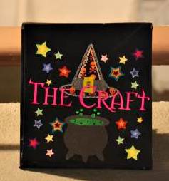
The Craft: This movie came out when I was in 8th grade and I loved it. It is such a great movie for my generation. This table and movie represents witches! A classic part of Halloween. The color for this table was pink. For this sign, I digitized the font using the same font that they used for the movie posters. It took a log time to find this font and had to use a font search engine that allows you to upload pictures of the font and then searches for the same font. I had the most difficult time finding this font. I also used a giant cauldron and some pretty stars to jazz it up. Let me tell you...all those thread changes with the stars was not fun! What was I thinking??? But it looked so good...I think it was my favorite sign of all of them.
The Nightmare Before Christmas: This tables color was orange! This seemed perfectly fitting since Jack Skellington is the Pumpkin King! For the sign, I used the same font as the Nightmare Before Christmas movie and download this great Jack design off Etsy. Trying to do Jack without using black thread was definitely a challenge!

Frankenstein: another classic! This tables color was green....of course. The font I used for the name is the Frankenstein font. I also found various Frankenstein designs to use on the sign and a cool mad scientist laboratory type border and beakers.

Army of Darkness: Those of you who know this movie know that it is fantastic! And totally needed at a Halloween wedding...and those of you who don't know this movie? Its a cult classic campy comedy horror film. If you watch it while realizing that...its fantastic. If you have no idea what you are getting into, you might think it is completely bizarre! In any case, the color for this table was blue. I used the true Army of Darkness font from the movie. I also found a book design and deleted what was on the cover and put a skull there. This was crucial because the Necronomicon (Book of the Dead) is a crucial part of the movie. I also put the classic key words Klatu verata nikto around and added the dead skeleton rising to complete the sign.

Addams Family (Values): My favorite movie of all time!! Do you know this movie? It has the most hysterical jokes and dry humor that is easily missed. Also, one of my dogs is named after Wednesday from those movies/tv shows. When I named my dog Wednesday, I thought that would be obvious. But so many people ask if it is because I got her on a Wednesday or ask why i named her that. Apparently I am getting old!! (not really...I'm only turning 30 this month...watch this space for a major birthday giveaway!The younger people don't know of the Addams family! How tragic...they are wonderful Moving on...the color for this table is purple. I used the true Addams family font from the movie for the table name. Then I used a gothic victorian collage of designs on the sign. I think it turned out gorgeous. I need to us that design on some pillows or something for the home.

Casper: did you think i would forget ghosts??? Of course not! Growing up, I loved Casper! And I was constantly told that I looked like the girl from Casper- Christina Ricci. And Devon Sawa at that age? Ladies of my generation...am i right? Dreamy... Guess the color of this table....did you guess white? Correct!! I used the same font as the movie for Casper and found some great ghost designs. If you look closely, one of the ghosts are shopping and wearing jewelry! How appropriate!

House of 1000 Corpses: Not all of you might be familiar with this movie, but it was written and directed by Rob Zombie of White Zombie and later Rob Zombie fame...great music! This movie took several years to get pushed through...it was too graphic, was going to get an NC-17 rating------ that and it finally made it into theaters years after it was made! There was a sequel made right after this one was released, the sequel is called The Devils Rejects and all the characters look so much older! This is because the first was filmed so long before it ever came out. Also as a side note, Rob Zombies very pretty wife also stars these movies. Ok enough of the movie. I did the font in a skull alphabet font, found various tombstones and placed them all over the sign to make it look like a graveyard with 1000's of corpses...hahaha I'm so funny. The color of this table was silver.

Pirates of the Caribbean: This tables sign was my second favorite. I spent so much time digitizing and then embroidering this one. And making the jewels by using hot fix crystals....ahhh so pretty! The color for this table was gold. I used the same font as from the movie. I used a pirate ship, some crossed swords as a border, and a treasure map and telescope. The little dots you can see above the swords on the bottom right of the ship are the hot fix pirates booty (jewels) I put there.

Scream: Another classic for my generation! Great slasher flick! The first couple of these movies came out when I was in high school and were instant hits. I love these movies! So it was natural for me to have a table for Scream. The color for this table was black. I first found a great grim reaper that I used for the sign. And then I digitized some scream mask faces to us on the edges. For the font I used the exact same font they used for the movie. I did the font in a metallic black thread and then used red hot fix crystals to outline the letters inside.

So what do you think? Are you excited to see what the decorations/centerpieces on each table looked like?

I'm so impressed. The themes/designs were so well thought out and the stitching beautifully executed. I would have resort to hot glue or iron on appliques. I hope these turned into a quilt or wall hanging or throw pillows.
ReplyDelete