Pages

Tuesday, December 25, 2012

Vogue 8815 Peplum Top

Here is my much altered version of Vogue's 8815 Peplum Top. I've been a fan of peplums for a long time! You can see evidence of this here when I made a peplum top back in 2006! I snatched up the pattern when it was released and have been watching versions being made up around the sewing web. However, I didn't really like one thing about all those versions...the peplum started too high. It was made to start at the high waist and then the peplum would jut out from there and look like a maternity shirt from the side views! Being long torso-ed already, I did not need a peplum that started at the high waist..practically empire! (okay I know that is an exaggeration) So what to do? I got out my tape measure!

First I measured from my shoulder down over the bust to where I wanted the peplum to start and that measured 18". Then I measured from where I wanted the peplum to start to how low I wanted the hem to go. (adding additonal for hem and seam allowance) This meant I had to add 4" (I think..I'm away from the holidays and my altered pattern is at home--I'm doing this from memory). So I cut along the lengthen shorten line on the bodice and separated it by 4 inches and added tissue behind. I did this to the bodice front and back. Those pieces are done.

Next I measured the flounce/peplum. I had to shorten it by 3" to get the measurement I wanted. So I drew a line through the flounce, and then drew another line parallel to the first line but 1.5" below the first line. Then I folded these lines together to take out a total of 3". But unfortunately, by doing this, the piece gets all wonky and out of shape. To fix this, just line up your ruler at the top edge of the flounce and the lower end of the ruler at the bottom edge of the flounce and connect this line to make your new side. (You will need to add tissue under this) This should make your new piece. (Let me know if you want me to supplement this with pictures!)

The other alteration I had to make was to make a 1" sloping shoulders alteration. However, it looks like I need more according to the picture below. That is what those wrinkles by the neck mean right? I need to lift the outer edge of the shoulder up some. At least 1/4" maybe even 1/2'? That's crazy. Is this drafted for super square shoulders??


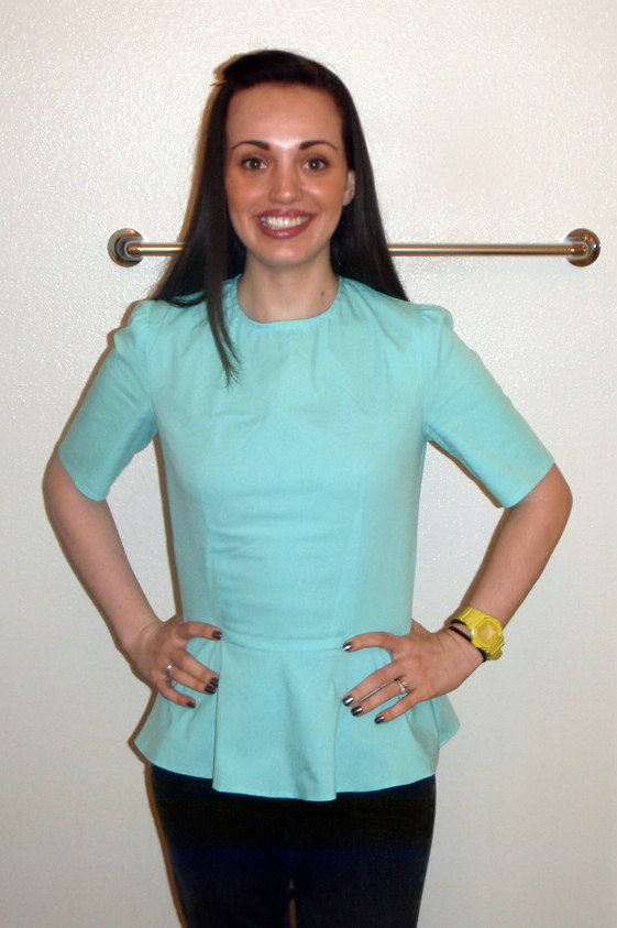
I also used an invisible zipper and bias binding around the neckline. Another thing...these sleeves are horrendous! I don't know what it is, I have never had a sleeve behave this way. There is plenty of sleeve cap ease, but not too much and I set the sleeve in fine but it is like completely flat or does not have room for the shoulder? It is bizarre..in any case, I am using different sleeves next time. (and yes I fixed the sleeve when I did the sloping shoulder alteration instead of lowering the armhole more)


I used stretch cotton poplin from FabricMart when they had all those colors for 1.99/yard earlier this year. This fabric is super thin and wrinkles very easily. I originally bought a bunch of colors to use for pants but there is no way this fabric will work for me to make pants. (Check out Lladybird trying to make pants from this fabric) I was using it to test out the pattern for when I use my pretty stretch silk poplin type weight that I got at Metro Textiles in New York.


I love how the side view does not look maternity! Yay! Mission accomplished! Lastly, I noticed as I was wearing it, that the waist would ride up. In hindsight, this makes sense because the original bottom of the bodice that attached to the peplum was made to be up at the natural waist and I lowered it to the high hip which is wider. So I now realize that it makes sense that it would need more room. So next time I need to make sure I add a little to where the bodice and peplum connect to keep it from riding up. I know it sound like so many alterations but it means I can make it exactly how I like it. Plus it looks so cute!

Wow how many times did I say peplum??

Don't forget to enter my epic birthday giveaway! I am extending the deadline to enter until after the 1st of the year so that people who are super busy for the holidays (me!) can have time to enter. One person will get 30 goodies! Make sure you go and enter!

You can see more detailed pictures and a list of all
30 giveaway items on the original post.


Pattern review can be seen here.

Wednesday, December 19, 2012

Epic 30th Birthday Giveaway!

Here it is! The day you have been waiting for! (Or maybe I have been waiting for because it is highly unlikely you all are waiting for me to do a giveaway...) Today is officially my 30th birthday. And it is also my puppy Pumpkin's first birthday! Today, I have an epic giveaway that consists of 30 things in its honor! Ready to see the swag???


Now it's hard to fit 30 things into one picture and make it look nice so I know it looks a little crowded in that pic...and it is even missing one! So I took some more individualized pictures so you can see it in detail...


1. Set of brown faux leather buttons
2. Set of ceramic blue and white flower buttons from button mad
3. Set of white sparkly buttons--same as the ones used on the naughty sailor dress
4. Package of vintage blue lace seam binding
5. Package of vintage blue green seam binding
6. 22 inch long blue green zipper to match the seam binding
7. 22 inch brown invisible zipper to match the fabric being given away below
8. Brand new seam ripper (can never have enough of those!)
9. Pair of bra cups for your next swimsuit!
10. Cute ladybug travel size nail file


11. Vintage lilac silk buttonhole twist on wooden spool


12. Butterick 5484 OOP pattern in sizes 8-14
13. Ready Set Serge book by Georgie Melot
14. 1 yard of 60" high quality fusible tricot interfacing


15 & 16. 2 yards of brown and white polyester charmeuse houndstooth print
17. 1 1/2 yards of orange ponte (we will only call it 1 item even though its 1.5!)


18. A PR button handmade by Nhi--she made a bunch of these for us when we went to a sewing expo so we could find other PRers!


19. A roll of pink and purple stretch elastic trim (so perfect for headbands!)
20 & 21. 5 yards of fuchsia sequin trim--remember the sparklier the better!
22, 23, & 24. 3 yards of 2" wide elastic--perfect for yoga pants
25, 26, & 27. 3 yards of black foldover elastic (perfect for So, Zo's underwear and tank tops/vest patterns)
28, 29, & 30. 3 yards of ban roll to keep your waistbands from stretching out

Phew! That is a lot of stuff...I know I actually cheated and gave more than 30 if you count the quantity but I figure the more the merrier!

So the rules of the giveaway?? 

1. I will ship anywhere on planet Earth
2. You must follow this blog with the Join This Site button in blue on right right hand side of the blog so that you show up as a follower OR you may subscribe by email which is on the top left hand side of the blog, just enter your email address and then activate it
3. Leave a comment on this blog post for the entry (after "joining the site" or subscribing by email)
4. You can gain an extra entry by following me on Pinterest - just leave a separate comment stating so--button is also on the right hand side of the blog
5. You can gain a third entry by mentioning this giveaway on your blog and leave another comment letting me know--except chances are I already follow your blog and will see it!

This giveaway will be open until the 1st at midnight PST--I will announce the winner on the 2nd!!

THIS GIVEAWAY IS NOW OVER! THANK YOU FOR PARTICIPATING!

I hope you all enjoy this giveaway...I would love to do some more often but did not feel there was enough people reading or interest in winning! So if this giveaway goes well, keep an eye out for more! Thanks everyone for all your support and for reading my blog..I love each and every comment and reader!!  

 Stay tuned for some exciting news in the new year.........

Monday, December 17, 2012

Awesome Birthday Dress!!!!


My Oona pic---there is a
jello shot in there!
Can I just tell you how much I LOVE LOVE LOVE this dress???  This is the Burdastyle Colorblock dress from the February 2012 issue #117A/B. There have been so many fantastic versions all around the web that I bought this issue immediately upon seeing the first one. Yes...that was back in February. Color ideas and fabrics have been brewing the entire time. I knew I wanted black and chartreuse and fuchsia..but the fourth color was a mystery to me. I thought maybe gray, or maybe repeat the chartreuse and pink somewhere else...but nothing was working right. Then the thanksgiving sale email from Gorgeous Fabrics came in and showed the super fun houndstooth doubleknit and I knew that was it. All the other fabrics were pontes and as far as I can tell from research around the web, pontes and doubleknits are pretty much the same. I knew it was important that all the fabrics have the same weight.

The chartreuse ponte is from Fashionista Fabrics (so sad they are going out of business!), the fuchsia ponte is from Sawyer Brook fabrics, the black ponte roma is from Joann's...I always have a stash of it, and the houndstooth came from Gorgeous Fabrics as I wrote above.

I got the amazing sparkly riri zipper when I went to the garment district in New York at Pacific Trimmings. I have seen those sparkly zippers going for $40 for a mere 18" length! I got that 36" length for only $22! I think it's amazing. I just hemmed the dress to the exact length of the zipper. Also, I cheated..I did not make the zipper functional. I just sewed the back up and topstitched the zipper on.

This was my first Burdastyle pattern ever! And thank goodness I chose this one since it was the class pattern for the issue. I'm not sure I would have figured it out otherwise. But I feel much more confident in making Burdastyle patterns now..I always shied away because I did not know what size to make and if I want to make a Burdastyle one, I cannot just open the pattern and go, I have to trace and add seam allowances, etc. No worries! All that is over now! Size 34 worked perfectly. I only added 3/8" seam allowances and took a 5/8" at the top of the neck tapering back out to just 3/8" by the shoulder blades and the rest of the way down. I added 3/8" seam allowance by cutting with this seam allowance guide attached to my rotary cutter. That way I did not have to trace pattern pieces again! This wonderful guide was sooo easy to use! It was the first time I tried it and I will be using it with every Burdastyle pattern from now on. See my notion review of this gadget here.


I did make a muslin, out of my crappy muslin knit...and yikes! Yikes! My husband said it was a Stegosaurus  dress..it literally had two large lumps going down the back...but also I was not being careful...just serging things up willy nilly and with all the patchwork...I definitely got my seams off some.

For some reason, no other reviewer notes this, but you have to pay very close attention to the diagrams. Because of all the angles and strange shaped pieces, you have to overlap and underlap some pieces without matching the edges or they won't line up straight...it's kind of like patchwork for quilting with 60 degree angles. I was extremely careful with the measuring and overlaps on the real version...and it turned out so well!

These are my shoes from
 metrostyle..click for source


Because I made the zipper non functional, it is a bit of a squeeze to get on but is still manageable. I hand sewed the three snaps on to the front about 1 hour before my birthday party began...I'm always so last minute! But the neckline is great and does not gape at all...I even took a rock on picture so you could see the non-gaping.
no gaping!


side views


back views

You can check out my pattern review here.

You can check out my post on Burdastyle.

Also, check out the link on Kollabora.

Lastly, my makeup! Readers of my blog know I used to be a makeup artist before I became a lawyer, and my opportunities to do fun makeup are few and far between so I take full advantage!

why am I tanner in this pic than below?
I really need to learn how to use photoshop..not only might that hair in the
middle of my face be gone if I knew photoshop, I might also be the same color
as I am in the other makeup picture above

I used:

Nars eyeshadow primer, Mr. Frosty by Benefit creamy pencil, Mac Chartreuse pigment, Nars Bladerunner dark green in crease, Lancome Action liquid liner on bottom, clear sparkle liquid liner from NYX on top covered with loose Chartreuse glitter from Mac and several coats of Maybelline Full N Soft Mascara. I also used an angled brush in Mac carbon shadow to line the inner rim of the lower lid. Powder sticks to the water line better than a pencil liner and lasts longer.

My lips you can see above were completely lined and filled in with Mac Magenta lipliner and then covered with a light pink sparkly gloss that I have had so long I don't even know what brand it is or color anymore! It is all rubbed off!

I had a wonderful party but the big fun is on Wednesday...my official actual 30th Birthday! I will be having an epic birthday giveaway. My giveaway has 30 things! One big winner will get all 30 items! Be sure to tune in Wednesday for a chance to win.

Thank you all who came to my party! I had such a great time! And a special thanks to my husband for throwing it for me. It is my first birthday party since my 23rd..and it was amazing! You are the best!

Thursday, December 13, 2012

New Additions to My Etsy Store

Check out these adorable new additions to my etsy store! These are the cutest clips ever! I also added a listing for a Hair Clip Keeper to keep all those barrettes from getting lost!


Look at those little girlie skulls! On purple sequin fabric!


I love the back to school pencils! 


Cutest gingham bows and cowboy hats! Look at the cow print! 


These are the cutest Jewish themed barrettes I have ever seen. Perfect for the holidays!


And of course my favorite...Halloween!


 Look at the jewels on the princess crown and the anchor! I also love the penguin--so festive!


I love the bows on the cat and penguin!


This is a butterfly clippie keeper


And a princess crown clippie keeper


I also added these adorable vintage look rose earrings...love!

What do you think? I think they are the cutest! I have already sold a bunch to friends and family so I figured it was time to put them on etsy!  You can find all of these listed in my etsy shop.

Wednesday, December 12, 2012

Dog Bed Tutorial

I went into my sewing room yesterday to start a special birthday dress project but it was so crowded and cramped I had to clean a bunch first before I could even start tracing. And while I was trying to clear out room, this fabric and pillow kept haunting me..I kept moving it from place to place and it kept getting in my way! Now I have had this retired pillow forever and the fabric I have had since around 2002! Look at how fun the pumpkins are! And its very soft and comfortable fleece! I keep saying I'm going to cover the old pillows we retire as dog pillows because it is so easy. I'm sure you can guess where this goes.....it never gets done! Finally, after moving it around the room for the 4th time I said forget it! I am getting this pillow out of this room! So I grabbed the fabric and pillow and whipped up this dog bed. It took less than 20 minutes! The only thing that really takes time is the zipper but I promise it is so easy! I took pictures so I can show you. So stop procrastinating like me and make your dog a bed!


First, place your pillow on top of your fabric and cut around it with approximately 1/2 inch extra room all the way around. 


Here is a closeup of how much extra room I left around the pillow when cutting. You can measure if you want, but since it is just meant for being on the floor, and the pillow is flexible and can fit inside even if the seams are off a little so I just eyeballed it.


Next, take one of the long sides, right side up, and turn under your 1/2 seam allowance and pin to the zipper. The picture above shows me turning the seam allowance under and placing it against the pillow. 


While turning the seam allowance under, pin it against the zipper tape as shown above. I pin in direction I am sewing so I can pull the pins out as the presser foot approaches.


Place the zipper foot on your machine and move the needle position all the way to the right. Sew while keeping the presser foot on the right edge of the fabric.


Because this is a dog bed, I wanted it to be extremely sturdy. So I did a second line of stitching over the zipper--a stress point. So I moved the needle all the way to the left this time, and ran the presser foot right the right side of the foot along the edge, same as before. Only this time, since the needle position was moved to the left, it made a second topstitching line.


Repeat for the other side. The picture above shows me turning the seam allowance under on the other piece and pinning it to the other side of the zipper tape.


Stitch along the side, this time moving the needle all the way to the left and keeping the left side of the presser foot along the edge.


I then moved the needle to the right and repeated my stitching so I could have the double top stitching to make it sturdy.


Very Important Step: Unzip the zipper 3/4 of the way. If you do not do this, you will have a hard time turning the pillow right side out when you are finished! 
Then flip the pieces right sides together so they are on top of each other with the wrong sides facing out and stitch all the way around the three sides without the zipper.


I find it easier to sew the entire seam and then cross back over with the next seam instead of pivoting at each side. This makes it sturdier and easier when turning corners. The picture above shows how I sew off the end of each seam instead of pivoting.


I also serged the seams to make it even sturdier. My four dogs are very tough on beds!!!


Here you can see it inside out after sewing. This is where I unzipped the zipper in the very important step above so that I can now reach through that opening and turn the entire thing right side out.

After turning, I zipped up the zipper and it was all done! See? Super easy!


And here is my little Buffy after I gave her her new bed! (I know I know it should be Pumpkin enjoying the pumpkin bed but she is 5 times the size of that pillow! It is just a standard sized bed pillow. She is 113 lbs and still growing right now so I will have to make a much larger bed for her.)

I hope this helps you all make your four legged family members some cozy beds! So I bet you are all still wondering, what about that birthday dress project? Well, I got started on it right after...want a sneak peek??


Any guesses on what I am making???  I'll give an extra entry into my epic birthday giveaway (when I have it soon) if anyone gets it right!!

Wednesday, December 5, 2012

Halloween Wedding Wednesday-Table Names and Signs


For our wedding, we decided to use the names of movies that all depicted a different part of Halloween for each of our tables. We had vampires, zombies, slashers, ghosts, witches, graveyards, etc to catch every aspect of the Halloween mood. Now that presented a very unique problem...there was no centerpiece that was going to work for every table. So guess what we did? We did different themed centerpieces for each table! They looked incredible...but that is for another post. This post is about the unique signs I digitized, compiled, and embroidered to designate each table. I was not intending on naming each and every design I mashed together and compiled to make each sign, but if you are interested, it is definitely something I can do.

I did all the signs on black broadcloth (which made color choices much trickier because you obviously want to use a lot of black in Halloween decor and I couldn't use black thread on the fabric!) which we wrapped around a stiff background. The best part about embroidering these several hours long each designs with multiple thread color changes? Getting to do it twice!!! Your table signs need to be double sided. Man was I in a time crunch doing these into the wee hours of the night on the final days.

We had ten tables of ten plus the the one sweetheart table. Also each table had a color theme which I will tell you here and you will see why in a future post.... (I had to lighten each photo so you could see the details and some of them look crooked because they were taken from their stand and placed against the railing of the ship to take the pictures...they didn't all quite stand perfectly..but when they were in the holders on the table they were square)

Ready?

Amityville Horror: This was our sweetheart table that only my husband and I sat at. And of course it was fitting since my name is Amity and it's a classic horror film! I used an outline haunted house and then digitized the big looming eyes in the background. The font I used was Lycanthrope and I used Font Engine in Embird to digitize it. The color theme for this table was yellow..neon yellow in fact! This is because yellow is my favorite color.


Dracula: What Halloween themed wedding would be complete without vampires? Especially since vampires are one of my favorite parts of Halloween! The color for this table is....RED! Obviously right? I did the Dracula writing in Blood of Dracula font which was used in our save the date and invitations and the rest of the design was done in gold metallic thread. (I have ways of making metallic thread work perfectly for me...especially since i used it so much for my wedding...if you want to hear what I do and some tips, let me know)


The Craft: This movie came out when I was in 8th grade and I loved it. It is such a great movie for my generation. This table and movie represents witches! A classic part of Halloween. The color for this table was pink. For this sign, I digitized the font using the same font that they used for the movie posters. It took a log time to find this font and had to use a font search engine that allows you to upload pictures of the font and then searches for the same font. I had the most difficult time finding this font. I also used a giant cauldron and some pretty stars to jazz it up. Let me tell you...all those thread changes with the stars was not fun! What was I thinking??? But it looked so good...I think it was my favorite sign of all of them.


The Nightmare Before Christmas: This tables color was orange! This seemed perfectly fitting since Jack Skellington is the Pumpkin King! For the sign, I used the same font as the Nightmare Before Christmas movie and download this great Jack design off Etsy. Trying to do Jack without using black thread was definitely a challenge!


Frankenstein: another classic! This tables color was green....of course. The font I used for the name is the Frankenstein font. I also found various Frankenstein designs to use on the sign and a cool mad scientist laboratory type border and beakers.


Army of Darkness: Those of you who know this movie know that it is fantastic! And totally needed at a Halloween wedding...and those of you who don't know this movie? Its a cult classic campy comedy horror film. If you watch it while realizing that...its fantastic. If you have no idea what you are getting into, you might think it is completely bizarre! In any case, the color for this table was blue. I used the true Army of Darkness font from the movie. I also found a book design and deleted what was on the cover and put a skull there. This was crucial because the Necronomicon (Book of the Dead) is a crucial part of the movie. I also put the classic key words Klatu verata nikto around and added the dead skeleton rising to complete the sign.

Addams Family (Values): My favorite movie of all time!! Do you know this movie? It has the most hysterical jokes and dry humor that is easily missed. Also, one of my dogs is named after Wednesday from those movies/tv shows. When I named my dog Wednesday, I thought that would be obvious. But so many people ask if it is because I got her on a Wednesday or ask why i named her that. Apparently I am getting old!! (not really...I'm only turning 30 this month...watch this space for a major birthday giveaway!The younger people don't know of the Addams family! How tragic...they are wonderful  Moving on...the color for this table is purple. I used the true Addams family font from the movie for the table name. Then I used a gothic victorian collage of designs on the sign. I think it turned out gorgeous. I need to us that design on some pillows or something for the home.


Casper: did you think i would forget ghosts??? Of course not! Growing up, I loved Casper! And I was constantly told that I looked like the girl from Casper- Christina Ricci. And Devon Sawa at that age? Ladies of my generation...am i right? Dreamy... Guess the color of this table....did you guess white? Correct!! I used the same font as the movie for Casper and found some great ghost designs. If you look closely, one of the ghosts are shopping and wearing jewelry! How appropriate!


House of 1000 Corpses: Not all of you might be familiar with this movie, but it was written and directed by Rob Zombie of White Zombie and later Rob Zombie fame...great music! This movie took several years to get pushed through...it was too graphic, was going to get an NC-17 rating------ that and it finally made it into theaters years after it was made! There was a sequel made right after this one was released, the sequel is called The Devils Rejects and all the characters look so much older! This is because the first was filmed so long before it ever came out. Also as a side note, Rob Zombies very pretty wife also stars these movies. Ok enough of the movie. I did the font in a skull alphabet font, found various tombstones and placed them all over the sign to make it look like a graveyard with 1000's of corpses...hahaha I'm so funny. The color of this table was silver.


Pirates of the Caribbean: This tables sign was my second favorite. I spent so much time digitizing and then embroidering this one. And making the jewels by using hot fix crystals....ahhh so pretty! The color for this table was gold. I used the same font as from the movie. I used a pirate ship, some crossed swords as a border, and a treasure map and telescope. The little dots you can see above the swords on the bottom right of the ship are the hot fix pirates booty (jewels) I put there.


Scream: Another classic for my generation! Great slasher flick! The first couple of these movies came out when I was in high school and were instant hits. I love these movies! So it was natural for me to have a table for Scream. The color for this table was black. I first found a great grim reaper that I used for the sign. And then I digitized some scream mask faces to us on the edges. For the font I used the exact same font they used for the movie. I did the font in a metallic black thread and then used red hot fix crystals to outline the letters inside.


So what do you think? Are you excited to see what the decorations/centerpieces on each table looked like?
Locations of Site Visitors